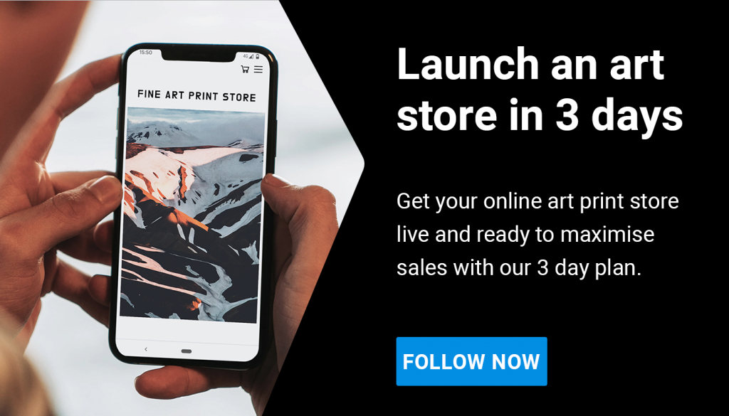
Executive Summary
We recommend you read this article in full for our advice on how to choose the best template for your online art store. However, if you are looking for some fast advice here you go:
| Platform | Best for? | Template recommendation 1 | Template recommendation 2 |
| Shopify | Most things! It’s our go-to platform. Easy to setup with good templates. Best -in-class e-commerce features | Highlight ($250) | Studio (Free) |
| Squarespace | Good for starting out, some decent templates. Fairly formulaic design. | Talva (free) | Stanton (free) |
| WordPress/ WooCommerce | Best for design flexibility. Not the easiest to setup, but there are lots of web developers who can help. | A.R.T. ($69) | Elegant ($59) |
Getting started
If you are an individual artist, then you are in the right place to find some great website template recommendations! If you are a gallery or a site that will showcase the work of multiple artists, please take a look at our companion article: The best website templates for galleries to sell art online.
Before we continue, note that colours, fonts and button styles of templates can be changed to match your style, so try to look beyond this and focus on site structure, the available pages and ways of arranging your content. Aspect ratios of images can also be changed, and we will also show you how to do that in this article.
However, keep in mind that the reason these templates look beautiful is because they have been designed with their specific styles in mind. So when choosing a template, you have to think how the design aesthetic of the template would fit if you change the colours, fonts, font sizes, button styles and image aspect ratios etc. This is why it is advisable to choose a template which is close to what you want as an end product.
If you are not too confident with designing yourself, we recommend that you find a template on this list that is close to what you need, and then use a designer for 1-2 days to help you adapt the template in a way that works.
Platform choice
In terms of deciding which platform to go for, if you are not already signed up to one, here’s our advice:
Shopify is the best overall platform, and specifically the theme Highlight. This combination has everything you need and more for the perfect online store and website. Further details are given throughout this article.
We think Squarespace is a great option for the individual artist because it has lots of clean, tasteful designs ready to go out of the box and it allows you to group your images or artworks into categories in the stores. The sites have portfolio and project page options, great blog designs and the store checkouts are fairly straightforward too.
However, it should be said that you can also do all of that on Shopify too, and more. Both Shopify and Squarespace are plug and play systems, which make them really easy to use for anyone. Shopify is the clear leader in ecommerce with far better checkout options which reduces friction for your buyers, superior order fulfilment and management features, and more channel integration options such as TikTok, Instagram etc. If need more complex site architecture, like the ability to present collections in multiple ways, then Shopify leads in this department too.
WordPress and WooCommerce have a lot more options in terms of templates. Unlike Shopify and Squarespace, WordPress is open source, meaning you can build a site from the ground up with little restriction. If you are not comfortable with coding, there are also loads of web developers out there who will help you make adaptations for minimal cost.
Ultimately, you should decide which one is best for you. The opinions we express here are just personal ones, and we like all of the platforms for different reasons. Shopify & Squarespace are both identical in terms of pricing at £24 a month for the features you need for e-commerce as an individual artist. WooCommerce is open source so it is cheaper. With all platforms you will incur card payment fees when you sell a print, and the comparison of those fees is outside of the scope of this article.
Recommended templates for Shopify
Option 1: Highlight
We love the Highlight theme. It is clean and minimalist and has lots of excellent scrolling parallax effects which gives a real quality feel to the site. It is smooth, well built, and versatile. You can have your work in different collections and filtered in different ways. Also, there are editorial page options now shown in the template demo below. Lastly, what we like is the freedom with which the images are laid out, avoiding the grid-like feel that many templates opt for, so it feels more like an art gallery. Plus there will be no issues with aspect ratios varying between images. Here is a quick video preview:
This theme has a strong design personality and is certainly not bland, so for that reason it will not be to everyone’s taste. Buying the template at $250 is not the cheapest option out there, but for us this is worth the investment. It is the pinnacle of quality template design and build, and we believe the consequential increase in conversion rate will pay back that investment many times over in your first year. Overall, this template has everything you need and is our number 1 recommendation. Get this and you’ll have a great online art store!
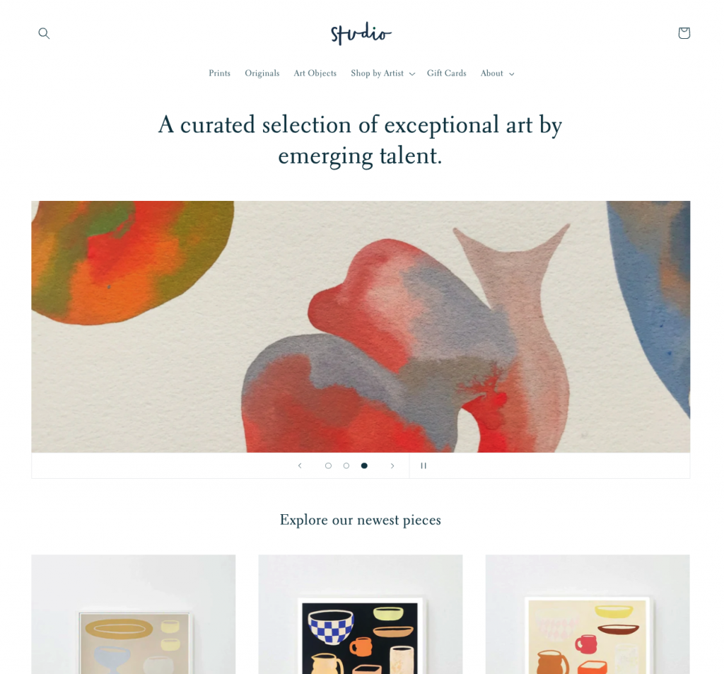
Option 2: Studio
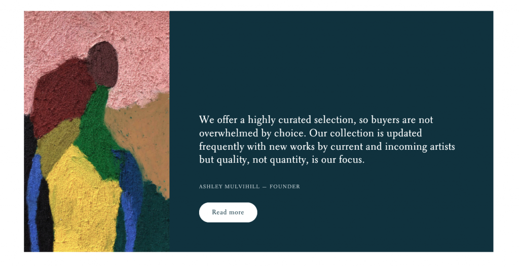
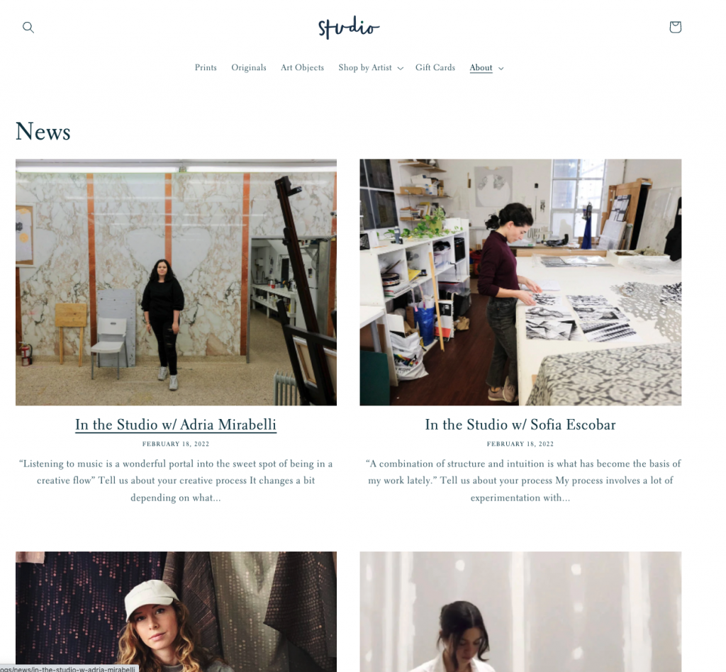
Next up is a template that we also recommend for galleries, and this one is free! The great thing about a template that could also serve the purpose for a gallery is that it works brilliantly for both purposes. If some of the pages are superfluous for you as an individual artist, then they are easy to switch off and you might find a use for them at a later date. Studio is a laid back, slightly decorative template. Here are features from Studio:
- The homepage has a nice clean feel which lets the images do the talking
- There are coloured feature panels to introduce a focus on a particular project
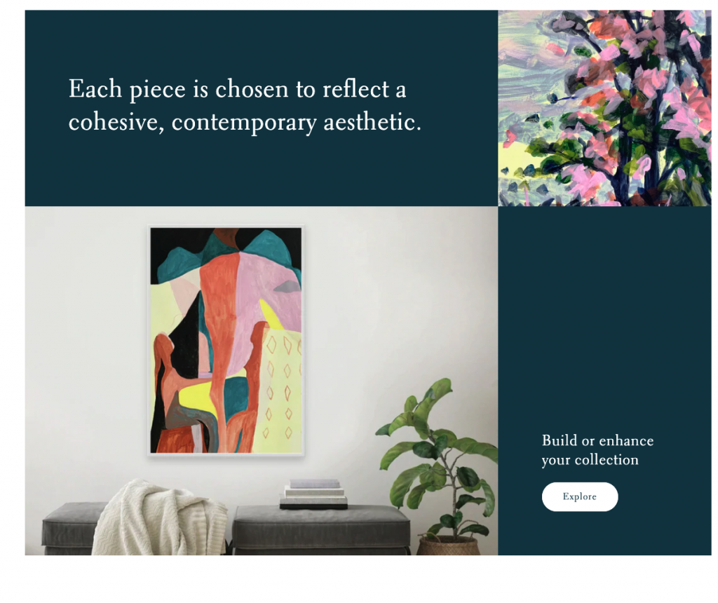
- And there are great editorial options to contextualise your work, which as we repeat regularly, is vital to driving collector interest.
- There are also these great CTAs (call to action buttons) on the homepage:
- Which can lead to content pages for more in-depth contextualisation:
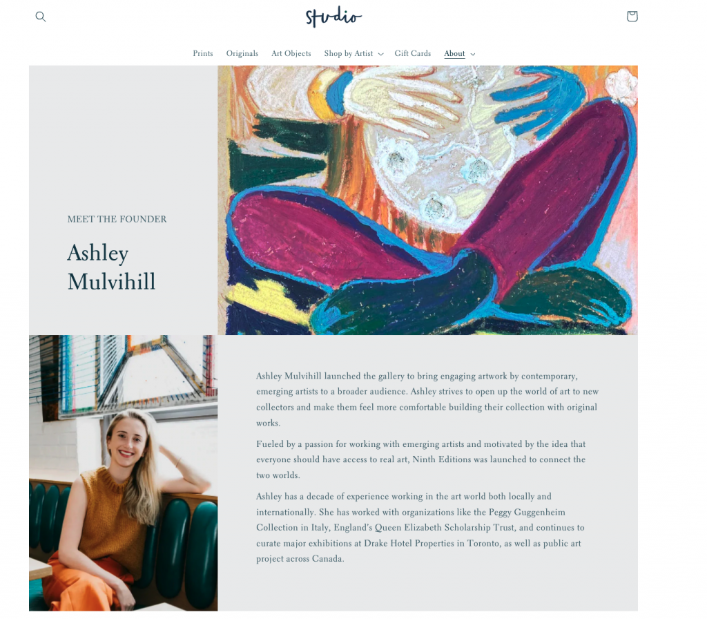
- Here you have great editorial element options.
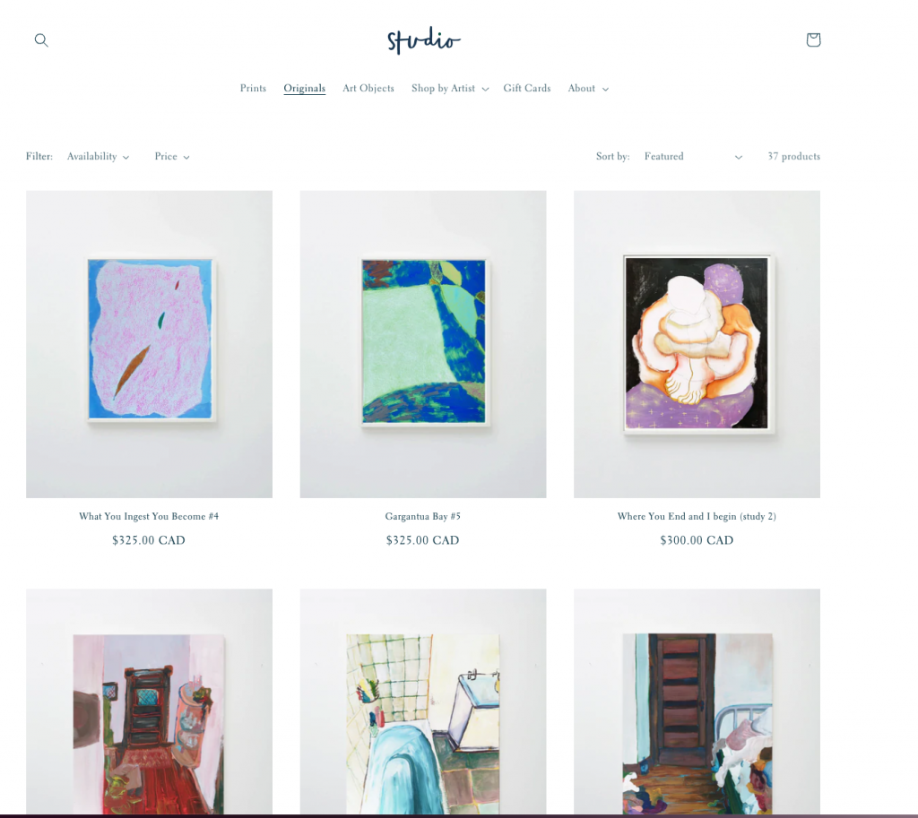
- Lastly, the product pages are nice and simple. If you are the photographer it would be possible to modify the CSS to allow for images anywhere across the site to be displayed in their original aspect ratios rather than being cropped and constrained by an identical grid like below. This is important for artists who have works of varying shapes, so for example photographers who shoot in both landscape and portrait formats, which would almost certainly be the case most of the time.
Recommended templates Squarespace
Option 1: Talva
The Talva template has pages with mosaic-style portfolios for images with variable aspect ratios, which is great. It is clean and easy to read, has great typography and displays the images big, and when clicked go full screen. The homepage focuses purely on the images and the project pages have an overview page that lists all your projects. Any page can be extended with further blocks, to add more content.
Out of the box the store pages, and the portfolio pages have square image containers, so this means the template will crop your images if they are not square. We recommend avoiding this by displaying the images in their native aspect ratios, i.e. without cropping. To do this in your Squarespace account open Design > Custom CSS and post the following code:
.products-flex-container > .list-grid > .grid-item > .grid-image .grid-image-cover {
  object-fit: contain !important;
}

.ProductItem-gallery-slides .ProductItem-gallery-slides-item-image {
  object-fit: contain !important;
}

.portfolio-grid-basic > .grid-item > .grid-image img {
  object-fit: contain !important;
}
Please note that with different templates this code might be slightly different, but anyone with CSS knowledge should be able to modify the code.
Here is the template in action with the homepage, portfolio, projects page and the store.
On the product details page, i.e. when you look at the store main page and then click on a product to make the size selection of the print, you should edit this to choose the carousel option:
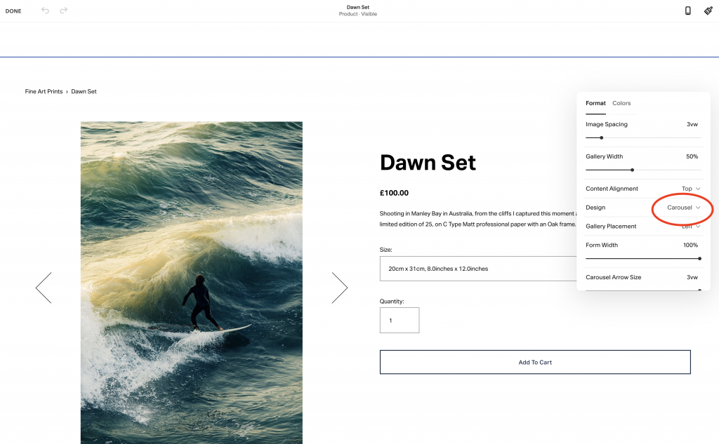
The reason for this is that the template automatically changes the preview images to show the correct wall preview for the size of print selected in the drop down.
Note: We added the hero image on the homepage as one of the preset blocks:
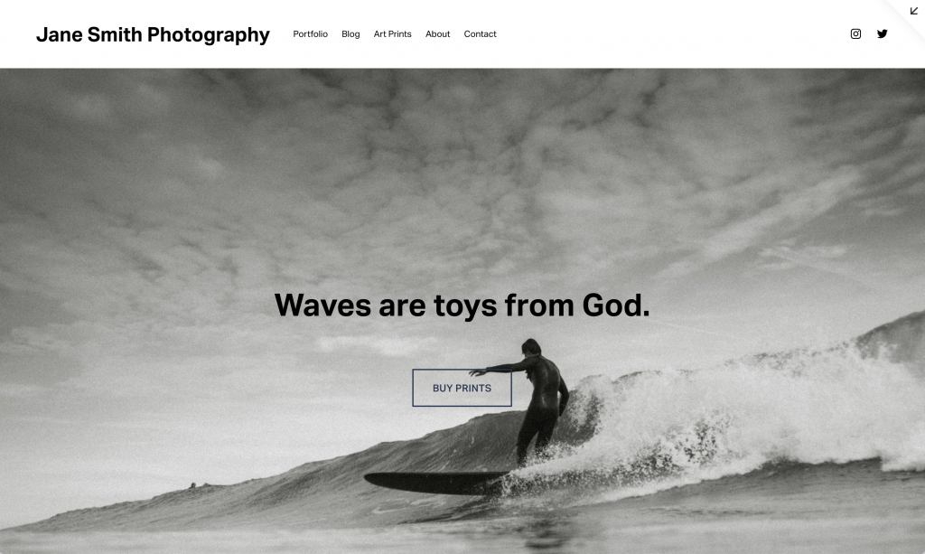
This didn’t come pre-loaded in the template. It is important, but not absolutely essential to be able to adapt your template using pre-made blocks, but you should be careful not to start to make the design drift away from the neat balance that it has when you first install it. If in doubt, you could pay for 1-2 days of a designers time to help you add in extra sections and make some adjustments where necessary.
Option 2: Stanton
As an alternative template, we also like Stanton, because it has all the same features but the homepage allows for more information about each project. This gives it a more editorial-style and feel. All of the same adjustments to the CSS can be made to make sure the images do not get cropped. Take a look at the homepage style here:
Recommended templates for WooCommerce/ WordPress
When you choose a WordPress site, the e-commerce part (checkout, products, orders database etc) is powered by WooCommerce. So you would buy a theme for WordPress as a whole for your website which may or may not have a store element. If it does have a store element then most WordPress themes are designed to work with WooCommerce. If it doesn’t, or it doesn’t have the right features, you can source a theme from WooCommerce for the store part.
We love WordPress for its flexibility, but it is harder to use. It is less plug and play friendly than Shopify or Squarespace. However, what it gives you is the ability to build a website from the ground up and adapt your sites to your exact needs.
Option 1: ART
We really like the template ART, which we also recommend for galleries. As the name would suggest, this versatile template has a version prebuilt for artists. The design is clean, beautiful and would really allow for your images to stand out. It also has great features like viewing rooms, editorial pages and a blog that allows you to contextualise your work. To get going, simply choose the ART template and use the version called Art Gallery, then remove the pages you don’t need.
Alternatively, start with the version called Design Agency, which has some pages that really showcase the mages and fits the text around them in an elegant way. You could then add in pages from other versions of the themes to create exactly what you want.
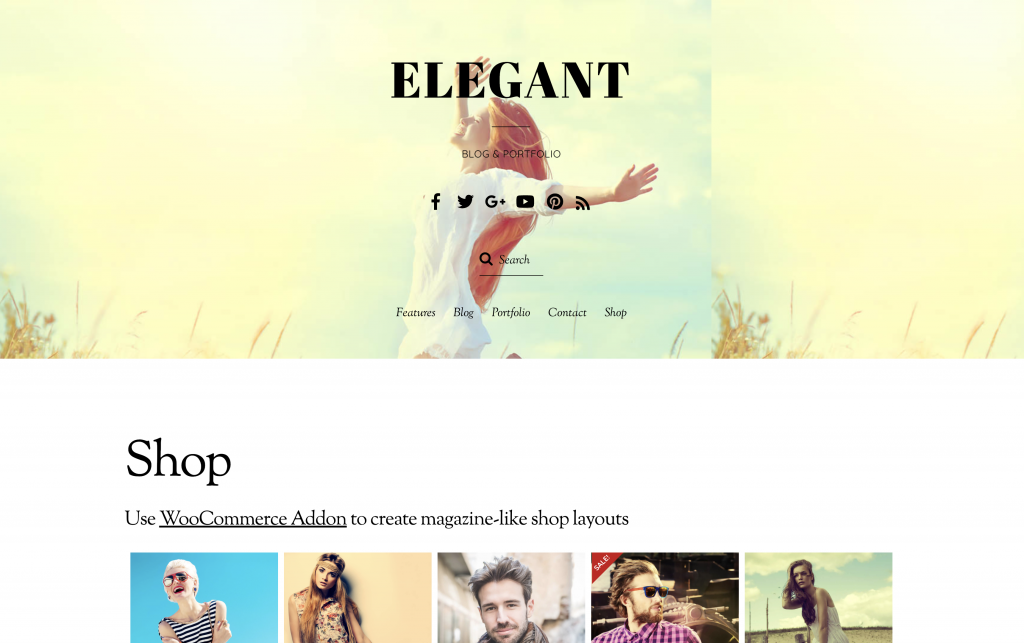
Option 2: Elegant
Our next recommendation for WordPress is the template, Elegant, which does exactly what it says on the tin! It provides an elegant look and feel to your images, which is different to the fine art minimalism feel of the ART template above. It also has lots of options for pages for you to choose from giving you the ability to assemble exactly what you need.
You might want to reduce the size of the header as it takes up a lot of space, but the intention behind it is to put an image there and to overlay the text over it. To do this, you need to choose an image that is either very light or dark and then place contrasting text over it. Note, select an image for this that will not fight with the text, like in the example they supply:
The key is to get something launched as soon as you can, and then work to improve the content as you go. Trust us, as veterans of literally 1000 website builds, you never end up needing all the content you initially think, and so if you do that first you will end up waisting your time.
The main thing is to spring into action with a clear plan. That’s why we wrote our 3 day plan to get your art store launched! Go read it, and get your new store launched!