
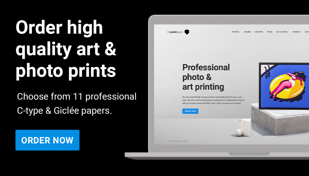
Seeing your art in print is a milestone in your creative practice is special, it makes your creative process so much more tangible. It feels like there’s a real, physical end result of your creative imagination, and just holding a physical print of your artwork can be an emotional experience!
Feeling the paper texture, and seeing the colours in natural light creates a deeper connection to your work and evokes a stronger emotional response than viewing it on a screen.
When you take this step then of course you want to present it in the most beautiful way, and there’s lots to consider; papers, borders, accurate colour reproduction, whether to frame or mount. It makes all the difference in the way your art is perceived.
What follows is a simple, step-by-step helpful process of how to get the best out of your prints.
Let’s dive in.

Step 1: Digitising Your Artwork, From Canvas to File
If your original artwork isn’t digital (for example, oil paintings, watercolours, drawings, etc.), the first step is to digitise it properly so it’s ready for printing. High-quality digitisation ensures that all the details, colours, and nuances of your piece are captured. There are two primary methods to digitise art: scanning and photographing.
Scanning: For smaller works on paper (and even moderately sized pieces in sections), a flatbed scanner can produce excellent results. Aim for a resolution of at least 300 dpi at the size you plan to print. Resolution is key: 300 dpi (dots per inch) is the standard for crisp prints; anything higher typically isn’t needed unless you plan to print larger than the original size.
When scanning, save the file in a non-lossy format such as TIFF or PNG to preserve all the detail. This gives you a master file with no compression artifacts. You can always create smaller JPEG copies for web use, but keep your print file in a high-quality format.
Photographing: For larger artworks or paintings with texture (canvas, impasto), a high-resolution camera may be more practical. Set up your artwork flat against a wall or on the floor and use a tripod to position the camera perfectly parallel to it. Good, even lighting is crucial – natural diffused daylight or a pair of softbox lights at 45-degree angles to the artwork can help avoid glare and shadows. Use a high resolution setting (or a camera with a large sensor) so you capture maximum detail. Many professionals use DSLR or mirrorless cameras with a standard lens (around 50mm) to avoid distortion.
If you’re serious about colour accuracy, include a gray card or colour checker in one shot to calibrate colours later. After shooting, you can crop out the card and adjust colours in editing software so the digital image matches the original artwork’s colours as closely as possible.
No matter which method you choose, take your time with this stage. There are many professional services out there for both scanning and photography, if you do not want to do it yourself.
A well-digitised image is the foundation for a great print. Make sure that you, or the service digitising your work for you, clean up any dust spots or imperfections in the digital file using photo editing software, so your print will be pristine.

Step 2: Preparing Print-Ready Files
Once you have your artwork in digital form, you may need to do some file preparation. First, work in the correct colour mode which is RGB. Ensure the image’s colour profile is embedded, Adobe RGB. Double-check the dimensions and resolution. If you plan multiple print sizes, you might have one master file at highest resolution and then resize copies for smaller prints to maintain 300 dpi. When saving your final print file, again choose a high-quality format.
A TIFF with LZW compression or a maximum-quality JPEG (if file size is an issue) are good choices. The goal is to retain clarity and colour information. It’s also wise to soft-proof your image at this stage (more on soft-proofing below in the Colour Management section) to predict how it will appear on paper and make any necessary tweaks (for example, sometimes boosting brightness or contrast slightly to counteract a matte paper’s effect).
Finally, always keep a backup of your edited, print-ready file stored in your creativehub account. Creativehub is the software that we built at theprintspace to store your files, make print orders and set up products to sell in your art stores for our print-on-demand service. You can make an account here.
Step 3: Choosing the Right Print Medium and Paper

One of the most exciting parts of printing your art is selecting the print medium and paper that best complements your work. Different papers and print technologies can dramatically affect the look and feel of the final print. Here are two main categories to consider:
Giclée Fine Art Prints: Giclée is a high-quality inkjet printing process using archival inks and fine art papers. This option is popular among painters, illustrators, and photographers alike. Giclée papers come in various textures and finishes, from smooth matte to richly textured watercolour paper, and from bright white to warm natural tones
If you have an artwork with subtle gradients or a painting that you want to appear as if it’s on art paper, giclée is ideal. The colours are vibrant and the prints can last decades without fading. A beloved choice in this category is Hahnemühle Photo Rag (a smooth matte paper with excellent colour reproduction), which is often recommended for its versatility.
Digital C-Type Prints: C-type (chromogenic) prints use a wet chemical process on light-sensitive photographic paper. They are essentially the modern version of traditional darkroom prints, and are usually chosen by professional photographers for its ultra-fine detail and continuous tone reproduction
C-type prints typically come on papers like Fuji Crystal Archive, in finishes such as glossy, luster, or matte. If your artwork is a photograph or a digitally created image with lots of fine detail or rich colours, a C-type print on a glossy paper can make it pop with sharpness and depth. The Fuji Matte paper, for example, is a popular all-round choice for its smooth finish and excellent colour accuracy.
We made a great easy-to-follow visual explanation of the two main fine art print processes here:
Beyond the print process, think about the paper characteristics: Do you want a heavy, textured paper to convey a sense of importance or tradition? Or a sleek, smooth paper to enhance contrast and sharpness? The paper should complement the style of your art and even add to its expression.
For instance, a charcoal drawing might shine on a textured rag paper, while a bright digital illustration might benefit from a smooth bright-white paper that makes colours pop. Because there are so many options, it’s wise to see and feel papers in person. We made a great video to help you choose
We also produced this deep dive visual guide on paper types, to help you choose:
Also, consider ordering a sample pack of fine art and photo papers. This contains all the papers so you can compare finish and colour rendition side by side.
Having these samples in hand takes the guesswork out of choosing paper and ensures you’ll love the look of the final product. Remember, the medium and paper are part of the art, so choose something that matches and complements the aesthetics of the artwork.
Step 4: Colour Management and Soft-Proofing for Print Fidelity
Nothing is more disappointing than receiving a print that looks different from what you saw on your screen. That’s where colour management comes in. To ensure your printed art retains the colours, brightness, and mood you intend, you’ll need to manage a few technical details. This is not as daunting as it sounds.
Here’s what you need to do:
Calibrate your monitor: This is the number one tip for any artist or photographer getting into printing. If you do only one thing towards making the colours of your prints accurate, we would recommend you calibrate your monitor.
Calibration means using a device (like a Spyder or X-Rite calibrator) to adjust your display so that colours and brightness are standardised. An uncalibrated monitor might be too bright or have a colour cast, leading you to edit your image incorrectly. By calibrating, you ensure that what you see on screen is a closer match to the actual print output.
It’s also a good practice to work in a neutral lighting environment, sometimes referred to as a “digital darkroom” meaning your room lighting is soft and neutral (5000K bulbs are ideal) and your walls aren’t throwing strong colours onto your screen. This creates optimal conditions for judging colour.
We made a straightforward video you can follow to help you calibrate your screen. Alternatively, if you live near theprintspace in London, Dusseldorf or Brookly, pop in and we’ll do it for you!
Working colour space: As mentioned earlier, use a wide colour space (Adobe RGB) for editing if possible, and then convert to the printer/paper profile when soft-proofing or exporting for print. And always embed the profile in the file you send to print so the printing software knows exactly how to interpret your colours.
By taking these colour management steps, i.e. calibrating your display and soft-proofing with the correct profile, you’ll vastly increase the chances that your print looks identical to your vision, with faithful colours and tones. It’s a bit of technical work that pays off with a beautifully accurate print.
Soft-proof your work: Soft-roofing is a pro-step, and it isn’t super necessary unless you have a really really critical colour requirement. Most of the time, a calibrated monitor and working in Adobe RGB will show you an accurate previous of your print on screen.
Soft-proofing is essentially a digital preview of how your art will look on a specific printer and paper. We provide ICC profiles for their printers and papers. These are small files you can download and load into Photoshop or Lightroom. When you soft-proof, that profile is used to simulate the print’s colour and contrast on your screen.
For example, a textured matte paper might slightly mute your blacks or dull down vibrant colours; soft-proofing will show that effect. If you see changes, you can adjust your file (perhaps bump up the saturation a touch or open up shadows) to compensate before printing. This saves you from trial and error and helps get the print “just right” on the first try.
Take a look at this deeper dive on soft-proofing:
Step 5: Making Test Prints to Refine Your Results
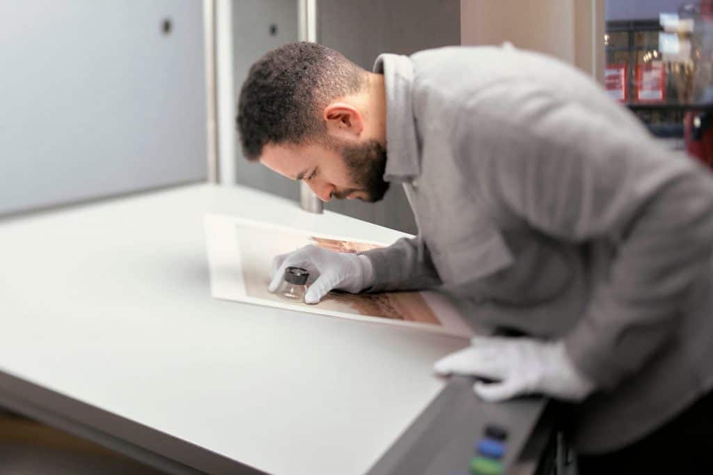
If you want to go belt-and-braces on controlling the end result in print then nothing beats seeing an actual physical sample. Professional artists often do a test print or a test strip before committing to a large final print, especially for very important pieces. A test strip Step 5: Making Test Prints to Refine Your Resultsis essentially a small print of critical areas of your artwork, usually done on the same paper and printer as your final, to check things like colour, exposure, and detail. We offer test strips of about 4×30 inches at a low cost, letting you see a long slice of your image printed at full quality.
You might place portions of your image that have the darkest shadows, brightest highlights, or crucial colour gradations onto this strip. When you receive the test print, examine it under good light. Are the deep shadows as detailed as you want? Do the colours match what you envisioned? If something is off – maybe the print is slightly darker than expected, or a certain colour isn’t as vibrant – you can go back to your file and adjust accordingly.
This iterative approach means your final large print will not have any surprises. If printing at home, you can also make small 5×7 inch proof prints of the whole image to get a sense of overall brightness and colour. For labs or online services, you might order one smaller print (say A4 or 8×10 size) before ordering a big batch or a large format print.
Running test prints adds a bit of time and cost, but it’s important if you are worried that your colours are delicate and they might not replicate perfectly, and you are making huge prints where the cost of getting it wrong would be high.
The great news is that we calibrate our printers in each of our production centres (the United States, the UK and Germany) to the same colour target, so if you run a test strip in the USA but sell a print in the UK or Italy a year later…the print will be identical.

Step 6: Mounting, Framing, and Displaying Your Prints Professionally
Printing your work is the realisation of the creative process, and our handmade finishing options can elevate the end result further. A well-chosen bespoke frame or mount not only protects your print but also enhances its visual impact, making it ready for gallery walls or pride of place in a collector’s home.
Here are some best practices for mounting and framing your artwork:
Choose a frame style that complements your art. The frame should match the aesthetic of your work and the environment. Gallery exhibitions often use simple, sleek frames, maybe plain black, white, or natural wood with a matte finish so that the artwork remains the focus.
For a modern photograph or bold graphic piece, a thin black or white gallery frame with a clean border is popular. If your artwork is more classical or you want a luxurious touch, you might opt for a thicker wooden frame with a natural or even antique finish.
Always consider the space where it will hang as well. A contemporary space might call for a minimalist frame, whereas a traditional space could accommodate something ornate. The idea is to accentuate the art, not distract from it.
Take a closer look at our handmade archival frame options here. Here’s some other things to think about when framing your work:
Using matting (mount board) in frames. Matting is the white or off-white border around the image inside the frame. A mat (mount) serves both an aesthetic and a protective function. A mat creates a visual breathing room around your art, drawing the eye inward, and it prevents the print from touching the glass. This is important because direct contact with glass can damage the print over time and cause the artwork to stick to the glass and mats keep an air gap that stops moisture buildup and sticking.
For works on paper and photographs, galleries and museums often use matting to give a polished look and to conserve the artwork
Our mount boards are acid-free and archival certified which means you won’t see any discolouration of your print over the years.
The size of the board is up to you, but a common guideline is to have the mat a bit wider than the frame’s width for a balanced look and often, the bottom board width is slightly bigger than the top.
Consider glass or acrylic carefully. The glazing (glass or acrylic) in a frame protects your work from dust and UV light, but it can also cause glare or slight colour shifts. For a truly professional display, you might invest in museum glass or UV-filtering acrylic that is anti-reflective. These options are more expensive, but they ensure that viewers see your art clearly without distracting reflections, and they help prevent UV light from fading the artwork.
When all is assembled, we make sure the print lies perfectly flat, the frame is clean, and the hanging hardware is secure. When displayed in a gallery, typically the centre of the artwork is hung at eye level (around 145–150 cm from the floor, depending on gallery standard).
Archival mounting options. Archival dry mounting is another great way to display your work, and this can be used with framing, or on its own.
This is where your artwork is stuck to a substrate (backing) which makes it beautiful and flat so the artwork can be viewed as you intended and it gives some substance to it. This can be attached directly to the wall, usually with wooden battens or velcro that keeps it flat against the wall, or it can be inserted into a bespoke handmade frame.
So what makes mounting archival? At theprintspace we only use acid-free glues to attached the artwork to the substrate. This means that the artwork does not react with the glue and dis-colour or get damaged over time .This is especially important for limited edition or valuable prints, where you want to preserve them in mint condition.
The front of the artwork can also have a transparent acrylic layer glued to it, so the the print is sandwiched between two pieces of acrylic, which is a hugely popular contemporary finishing option.
You can see our archival mounting options here.
Lastly, also consider a label or placard if it’s an exhibition, to include the title, your name, medium (e.g. “Giclée print on cotton rag paper”), and any edition number.
In summary, by framing and mounting your prints with care you are not only protecting them, you are also giving them the presentation they deserve. A professionally presented print says “I value my work.” It allows viewers to fully immerse in the artwork without any distraction or quality issue pulling them out of the moment.
Step 7: Lighting Your Prints correctly

The final touch in displaying your printed artwork is lighting. Good lighting can make your art look its absolute best, while poor lighting can dull the colours or create colour casts that alter the work’s appearance.
Here’s how to light your prints like a pro, whether in your studio, a gallery, or your home:
Avoid harsh and UV-heavy lighting & try to avoid exposing your prints to direct sunlight. Fluorescent lights are not ideal for art; they often emit UV and can distort colours towards an unattractive hue.
Use neutral, high-CRI lighting. The best lighting for art is one that renders colours accurately. Look for bulbs or fixtures with a high Colour Rendering Index (CRI). A CRI close to 100 means the light will show colours very faithfully (sunlight has CRI of 100). Modern LED gallery lights are fantastic because they can have a high CRI, emit very little UV or heat, and come in various colour temperatures. A neutral white light (often around 3000K to 5000K) is commonly used in galleries so that whites look neutral and the entire colour spectrum in the art remains balance. For instance, many museums choose around 3000K as a warm-neutral that flatters artwork without making it too cold or too warm
Angle and intensity. Position your lights at a 30-degree angle to the artwork if possible. This minimizes glare and reflections, especially if your print is behind glass. It also helps to highlight texture (if your print is on textured paper or is a canvas print) without casting long shadows. In terms of brightness, a common guideline is to illuminate the art about three times brighter than the ambient room light. By thoughtfully lighting your prints, you ensure that all the care you took in printing, framing, and colour-tuning isn’t lost. The colours will appear rich and accurate, and viewers will see the work in its best light (literally). Plus, proper lighting protects the art over the long term, preserving that celebratory print for years to come.

Start Your Print Journey – Celebrate Your Art!
There’s nothing quite like seeing your own artwork beautifully printed, framed, and lit up on display. It’s the moment your creation truly comes to life and it feeds back into how you make your work, as you would have a clearer idea of how it will translate to an end result.
We hope this guide has given you the knowledge to get more from the printing process.
Your art deserves to be seen IRL. So go ahead and celebrate your work in print!
Happy printing!