You can make brilliant work and still struggle to sell it online. Not because your art isn’t good but because people don’t feel sure about buying yet.
Social commerce is growing fast. In the US alone, EMARKETER forecasts social commerce sales will pass $100B in 2026 and globally, market forecasts put it in the trillions over the next few years. That means more people will buy on social. More buyers doesn’t automatically mean more sales for everyone. Brand is what makes the difference.

Why brand matters on social
People rarely buy the first time they come across you.
They notice a post. They like the work. They move on. Then they see you again a few days later and again the week after. At some point they click through and what they’re really doing is checking one thing, does this artist feel consistent? Can I see more interesting stuff that’s the same as the stuff that I liked. That’s the power of the brand.
There’s research backing this up too. A study in the International Journal of Asian Business and Management found that social media marketing doesn’t directly lead to purchase intention. It builds brand image and brand trust first and those are what influence buying.
So when you post, you’re not just “doing content”. You’re building the thing that makes buying feel safe
What “brand” actually means for artists
When we talk about “brand” in the art world, we’re not talking about logos or aesthetics. We’re talking about the feeling someone gets when they land on your profile. Does your work feel intentional? Does it hang together? Does it feel like there’s more behind it than a single post? That sense of coherence is what helps people feel comfortable coming back and, over time, confident that buying a print will feel like a safe decision. That quiet certainty is your brand, and it matters because social commerce runs on familiarity.
Here are a few practical ways to build that familiarity on social.
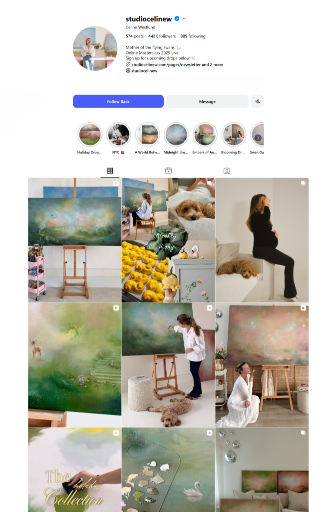
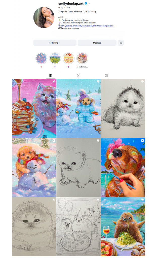
1. Visual consistency
Visual consistency doesn’t mean “everything must match”. It just means your page feels like one artist made it.
If all of your posts have different lighting, different edits, and different backgrounds, then people are not quite sure where they are or what they’re looking at. What you want them to do is recognise you and think, “Oh yeah, that’s that artist I love.” To recall their built-up knowledge about you and remember the great associations they have from looking at your work in the past.
Then they’re more predisposed to understand what they’re looking at, to relax and enjoy it, and to deepen and reinforce their positive emotional association with your artwork, what it means for them and what it gives them.
Here’s the simple thing most artists skip:
Create a tiny “brand kit” for yourself. Choose 2–3 colours you use often, stick to 1–2 fonts for any text (story captions, highlights, reel covers), and keep your photo editing consistent. It means your Instagram, your reels, and your shop page all feel like they belong to the same world.
If your work itself is consistent, you’re already halfway there. Consistent work is a brand.
Example 1:
Example 2:
2. Reels with a signature style
Reels work best when they feel like you. The real advantage isn’t just making reels, it’s being recognisable. Most people won’t buy the first time they see your work. They’ll see it once, forget your name, then come across you again later. When that second or third impression feels familiar, it creates a shortcut in their head: I know this account. That familiarity is what a brand looks like on social media.
Some accounts are instantly recognisable because they repeat a simple motif. It might be the way the video always starts. It might be a familiar setting. It might be a recurring question, a certain kind of interaction, or even the same tone of music. Within a second or two, you know what kind of video you’re watching and who it’s from. That consistency is doing the work. You don’t need to understand the concept every time. You already trust the format.
If you’ve seen any of these accounts before, you’ll instantly recognize them as you see the reel. They are recognizable for different reasons, but it’s that familiarity right up front that enables people to relax and enjoy the content.
Example 1:
Example 2:
So, the easiest way to build that familiarity is to give your reels a repeatable “start”. It could be the first brushstroke hitting paper, paint being squeezed onto the palette, the tape-peel reveal, the first pull of a print, or the same close-up angle on texture every time.
When you repeat the opening, you’re training people to recognise you before they’ve even read the caption. And once people recognise you, they come back.
Example 3:
Example 4:
3. Social proof that doesn’t feel cringe
Most artists feel a bit weird talking about sales. Totally fair. But sharing social proof isn’t bragging, it’s just helping new people feel sure. Because when someone is thinking about buying a print, they’re not only looking at the artwork. They’re also thinking, quietly: Do other people actually buy from this artist? Does it arrive looking good? Is this going to be a smooth experience?
Example 1:
Example 2:
That’s why collector photos and messages are so powerful. A picture of your work on someone’s wall does more than any caption ever could. It shows scale. It shows how it sits in a real home. And it tells a new buyer, “yes, this is a real thing people do.”
Example 3:
Keep it simple. When someone tags you in a photo, repost it to Stories. If someone sends a lovely message after their print arrives, screenshot it (blur the name if you want) and share it. If you get an unboxing video, repost it. Even a quick “packing orders today” clip helps, because it signals that your art is moving out into the world.
4. Comment replies matter more than you think
Your comment section isn’t just “engagement”. It’s part of how people decide if you feel real. When someone’s considering buying a print, they’ll often scroll past the artwork and look at what’s happening underneath it. Are you replying to people? Do you sound like a human? Are there real conversations, or is it just silence? It’s not that they’re judging you, it’s just how trust works online. A page that feels alive feels safer to buy from.
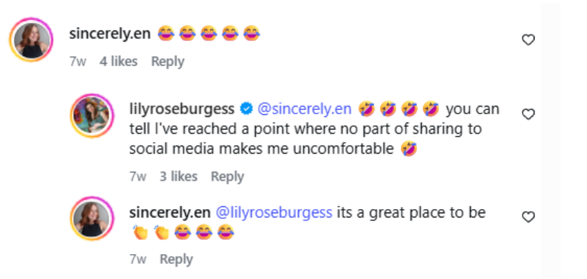
Replying doesn’t have to be a full-time job. Even short responses make a difference. A quick “thank you”, answering a question properly, or acknowledging someone’s reaction shows you’re present. And that presence builds confidence. It’s one of the simplest ways to make your brand feel established, because it signals that there’s a real person behind the work and that’s exactly the kind of trust that turns a follower into a buyer.
5. Consistency over time
This is the part that’s easy to forget when you’re deep in posting and planning: your work is doing most of the branding for you. The more your pieces feel connected through subject, colour, mood, materials, or even just the way you finish them, the easier it is for people to recognise you. And recognition is what turns “nice post” into “I know this artist”.
Consistency doesn’t mean repeating the same piece forever. It just means there’s a clear thread running through what you make and how you share it. When people see that thread over time, they start to trust it. They feel like you’re established. They feel like buying a print from you won’t be a gamble.
So instead of chasing new tricks every week, focus on the basics: keep making the kind of work you want to be known for, and keep showing it in a steady, familiar way. That’s how your brand stops being something you “build” and becomes something people simply associate with you.
David Shrigley case study – Building a recognisable brand
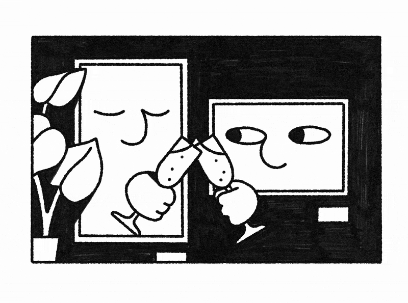
If you look at David Shrigley’s work for even a few seconds, it tends to “click” fast. To us, that’s the clearest sign of strong branding: the work is recognisable before you’ve done any thinking. The drawings are direct. The text looks hand-done on purpose. The humour is dry. Put together, it’s hard to mistake for anyone else and it’s often described as instantly recognisable.
What feels most “brand” to us is how little explaining the work needs. It doesn’t rely on long captions or context to make sense. The tone is baked into the work itself. Even when the subject changes, it still feels like it comes from the same mind. That’s not a design trick, it’s more like the work has a steady internal logic. You start to trust that whatever you’re looking at belongs in the same world.
Another thing we notice is how straightforward the presentation is. Nothing is competing with the idea. That clarity becomes part of the identity, and it’s why the humour lands so quickly and stays memorable. That’s a branding choice in itself: it gives the work a consistent posture. It also means the humour lands faster, because nothing around it is distracting. You’re not decoding design, you’re meeting the idea immediately and that directness is exactly what people tend to remember.
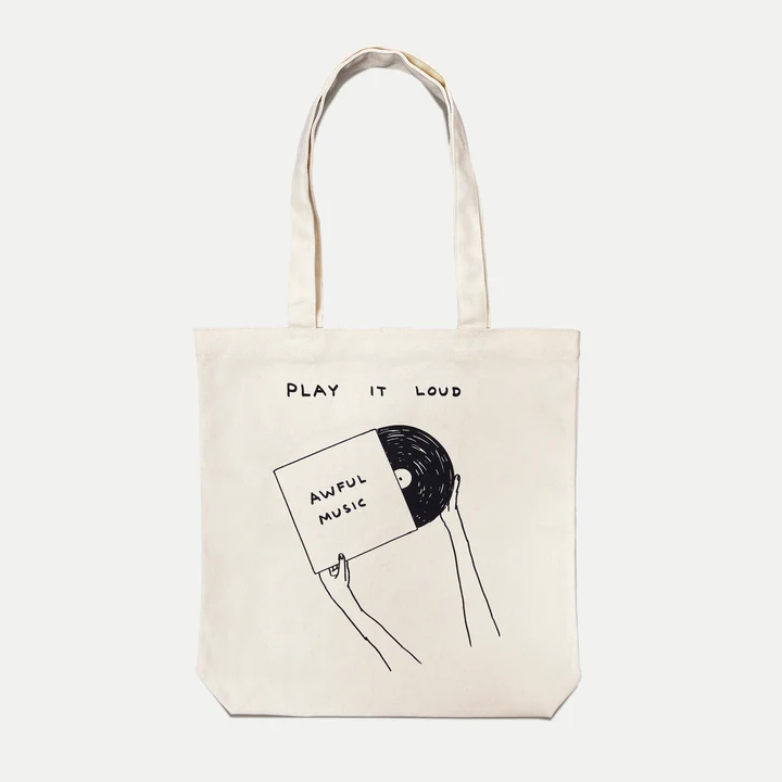
We also think his branding holds up because the work keeps its identity when it turns up in different places. His website points to collaborations and stockists carrying everyday items like cards, postcards, totebags, mugs, coasters and notebooks featuring his work.
What’s interesting is that it still reads as “Shrigley” even when it’s not framed as “art” at all, it’s just a mug on a kitchen counter, or a postcard someone’s pinned to a wall. That’s partly because the visual language is so clear, and partly because the tone is so consistent.
So, how do you create that consistency yourself? Firstly, your work will be consistent if it is an expression of your true, authentic self, character, philosophy on life, viewpoints, and things you care about. But it doesn’t hurt to be conscious of your work in retrospect, and to edit out the things which don’t clearly adhere to that consistency. The way you present things, the little motifs in your content, your brand style guidelines….these should be consistent in a very deliberate and conscious way.