This is a list of 25 action points to help you set up an online art store that will convert your website traffic into sales.
Whilst this list is comprehensive, you don’t have to do everything in order to improve your store and in most cases, the tips are very simple to implement.
You can easily get through this list in a few days and modify your site to make sure it does what is intended; to nurture relationships with long term collectors of your work, and help you grow your art career.
We have grouped these 25 tips into 4 key categories; content, design, checkout, marketing.
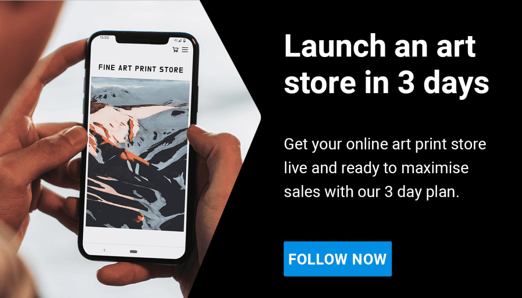
IMPORTANT: this list is packed full of great advice which is quick and easy to implement. After reading this article, use our checklist to work through it: Your 3 day plan to get your art store launched!
Website content
1. The magic ingredient is you
You cannot divorce the art from the artist. Art is a personal expression and, as with musicians or any other creative, people want to understand why you make the work you do.
Art collectors buy into you as much as they buy into your work, so it’s important that your website reflects this. Here’s how you could do that:
(a) Have a dedicated ‘about’ page or ‘about’ section on the homepage. Include a picture of yourself with some accompanying text that talks about your motivations for making the work.
(b) The ‘about’ section could also include a CV or historical timeline of the key moments in your progression as an artist, such as exhibitions, projects, press, books, published stories and education.
(c) Include a blog where you can write about your work and philosophy, or showcase images from your career and life.
(d) Share project development pictures on a blog or on the project pages where visitors can buy a print. It is always good to mix some personality into the project pages, rather than silo all of that onto one blog page.
(e) Have select pages from your sketchbooks on an ideas development, or inspiration page, or again on this could be included on your blog.
(f) Include pictures of you in your studio or out making work.
(g) Feature a video of you talking about your work or a particular project.
(h) Include images from exhibitions, events, awards, art car boot sales, talks and interviews. Show the person behind the art, that you are out there in the art community building your name and recognition.
As a general tip, integrate some of the more personal bits about yourself into your store rather than exclusively on an ‘about’ page or blog, where it is less likely to be seen. Below are some examples of all the above:
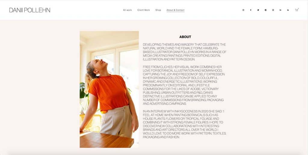
Danii Pollehn’s site has a great ‘about’ section which gives us the sense of how her open, expressive and positive personality channels into her work. Included are her motivations, work history, clients and links to interviews which not only gives the buyer the chance to learn more, but it builds trust by conveying Danii as the established artist she is.
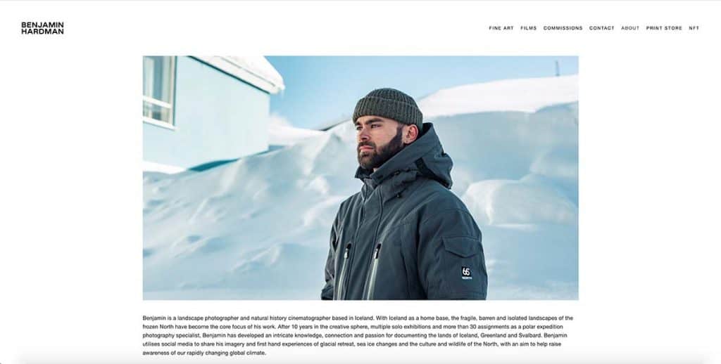
Benjamin Hardman has a fantastic ‘about’ page that leads with an expressive written bio. This is paired with an engaging video that gives a real understanding as to his motivations and passions for the landscape he lives and works in.
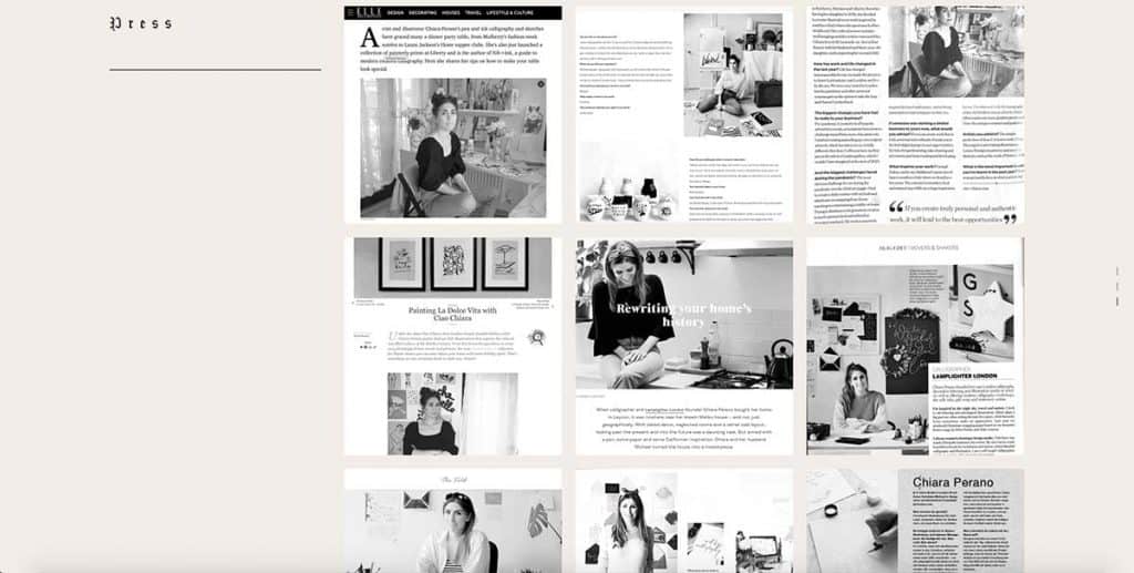
Chiara Perano’s site has a stunning ‘about’ page that also makes hero content of her press coverage. This makes clear to her site visitors that she is an established artist, which builds trust for first time buyers.
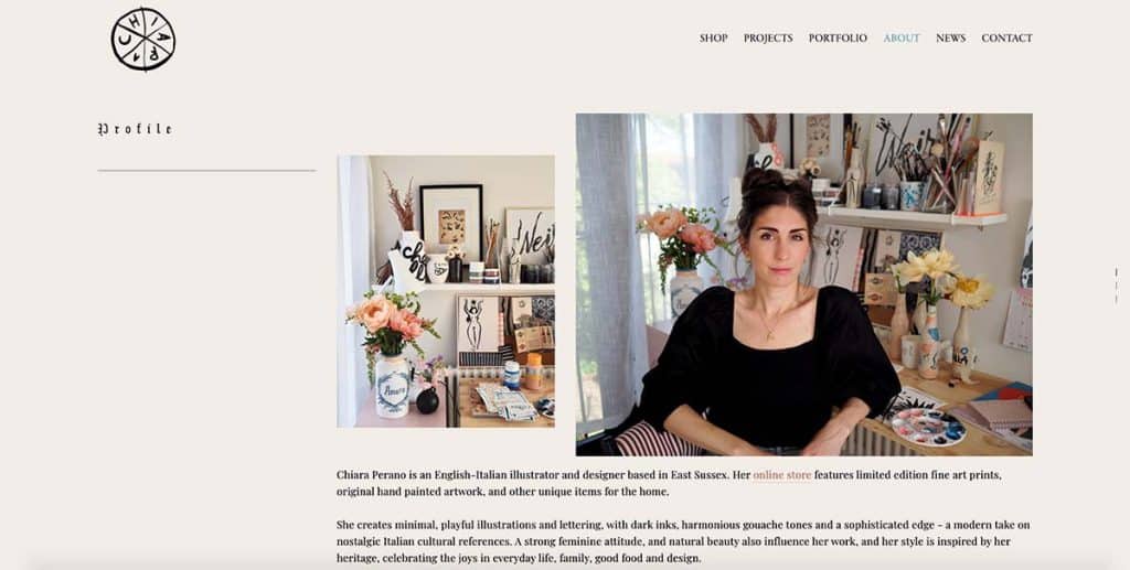
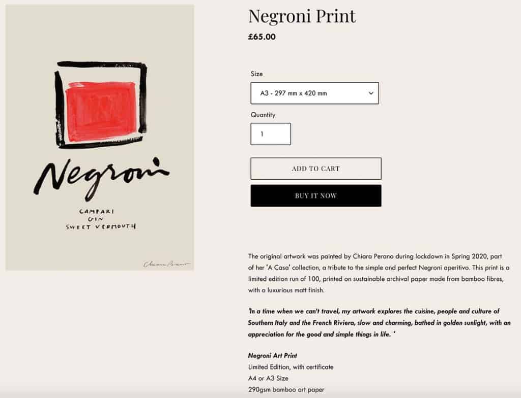
On the store pages, Chiara also includes a quote which adds some context to the work the potential buyer is looking at. This is really valuable, because it gives the buyer a ‘why’, a story to tell when their friends ask about the work. This tip can be the difference between making a sale, or not.
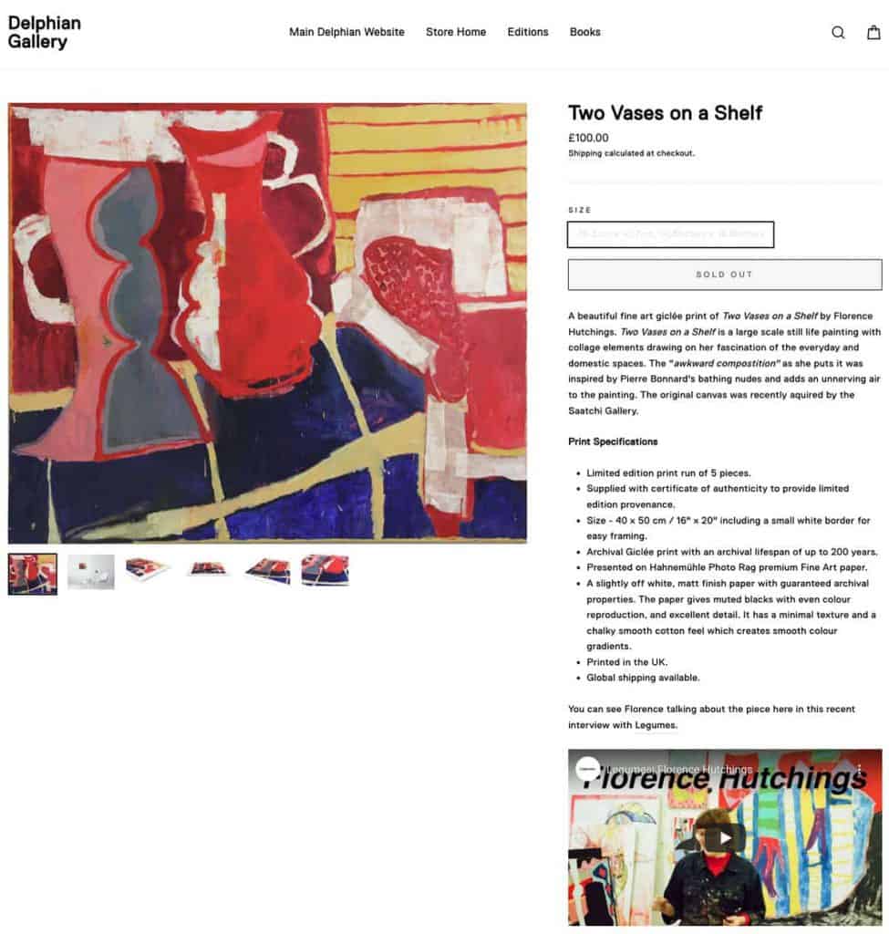
Delphian Gallery have taken a great approach with their product pages, and have included video interviews with the artist talking about their work, in this case Florence Hutchings.
Paul Harfleet’s site, Birds Can Fly, is a fantastic example of contextualisation of what drives him to make his art. It’s honest, moving and at the same time fun as it personalises Paul’s art. It shows how his history and passion for ornithology originated from early childhood and he has featured an amazing, creative video where he ‘gently references’ and reflects the birds he draws with his wardrobe. This autobiographical, open expression can be a hard step for artists to take, but it creates instant connection between the buyer and the work, giving it meaning beyond the aesthetics and form.
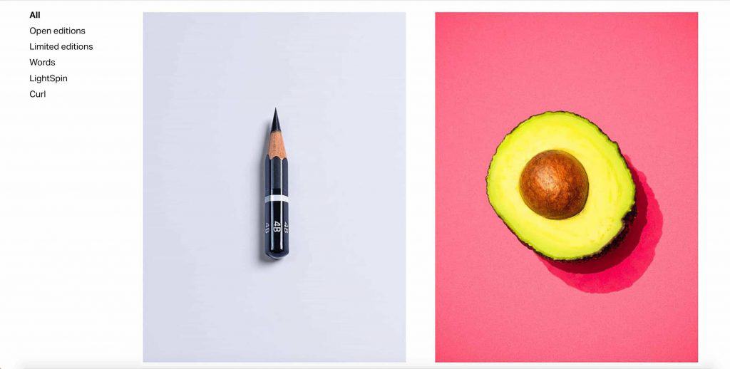
2. Make the artwork easy to see
Ultimately, your site is about the artwork, so showcase it large! All the other things you have on your site lead up to the visitor trying to imagine the artwork in their home, so the bigger the images are, the more immersive the experience. Visitors to your site won’t purchase a product unless they can see it properly, so make all your images large with the added option to view them full screen via a click.
We love Stuey B’s store and his use of large, bold imagery.
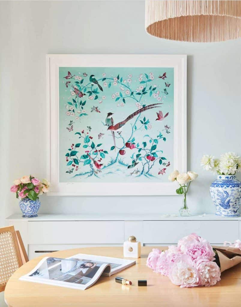
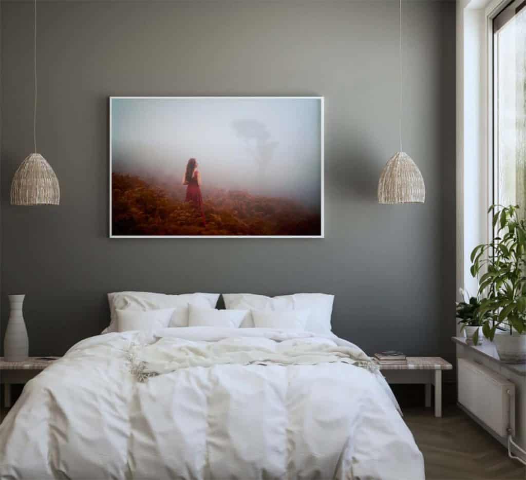
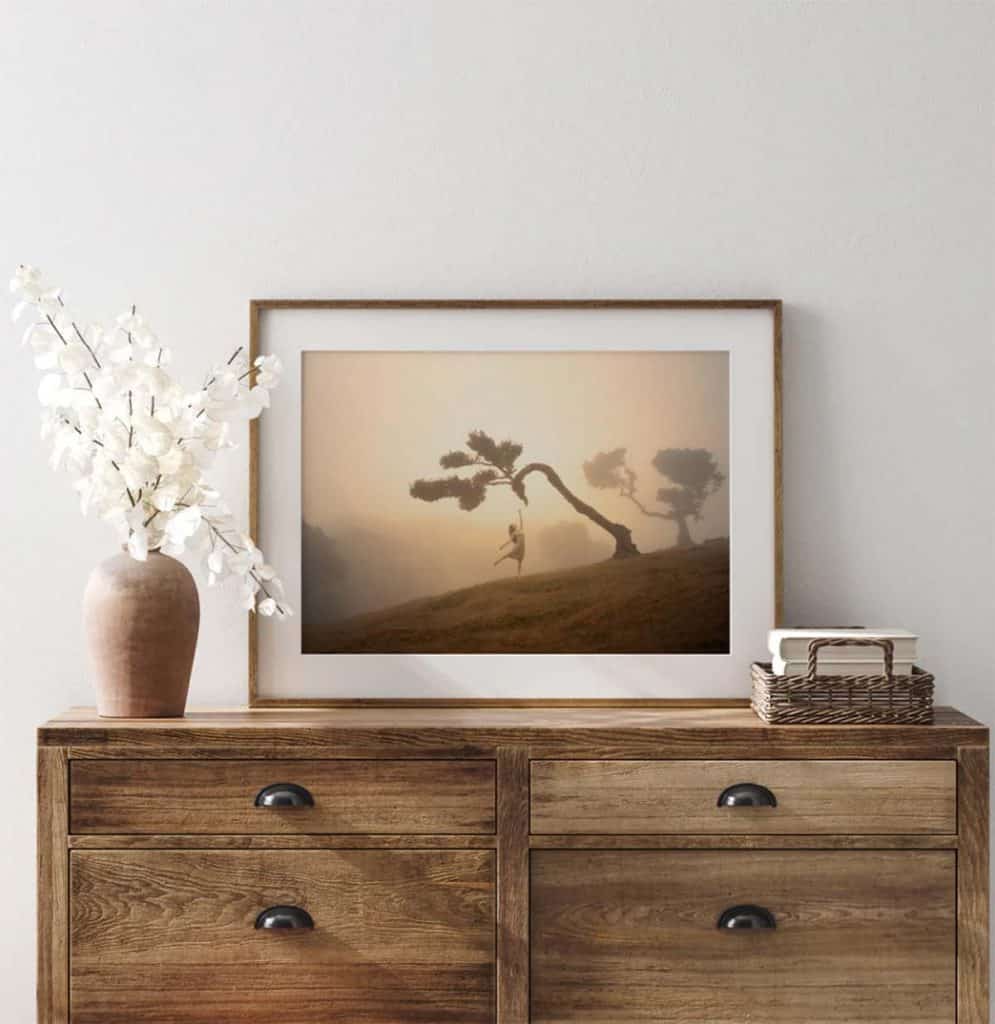
3. Invest in beautiful product shots
Your site will only look as good as the images and videos featured. For this reason, make sure they are consistent, sharp, eye-catching, interesting, creative and can be seen in a large format!
On the product pages, you should also show good images of the work on a wall. When making these it is important that the interior style fits with the type, age and demographic of your potential buyer.
If in doubt you can go minimalist as the more distinctive the environment you show the work in, the more it is possible that you could put someone who loves the work off, as they may not identify with the space it is displayed in. That said, if the environment compliments the artwork then this can increase the purchase likelihood. For example, take a look at Diane Hill’s site and the exquisite interior style that compliments her work.
Another great example of staging and scaling the print size is on Elizabeth Gadd’s site below. We love the way the frame style has been matched to the interior colour scheme, and how she has helped the user to really visualise different locations in the house to hang the finished works.
4. Typography & website copy
A good font choice will make text easy to read, and will augment the style of your work to help develop a clear brand. This is why it is important to take some time and choose a font that fits with your aesthetic.
For example, to give your site a fine art minimalist feel, use a font like Futura or Helvetica (or an open source font that is equivalent as some fonts have licence fees associated with them). Every font brings meaning and a certain style; you have fonts that are decorative, traditional, gothic etc. Pick your font carefully. If in doubt, choose a font that is clean, easy to read and minimalist, so that it doesn’t fight with your artwork images.
Your website copy must be easy to understand. Steve Krug’s landmark book about web design, Don’t Make Me Think, was one of the first books to identify the core principle of making sites easy to use and therefore high-converting in terms of traffic to sales. The premise of the book is to not do anything that unduly increases cognitive load on the user. In other words, do not write in a long-winded or difficult to understand style.
Keep things easy and straightforward when talking about the products, delivery times, the ordering processes etc. When writing the pieces about you and your work, make it as expressive, friendly and easy to read as you can, whilst of course remaining true to your own style of writing. We always advise that you get friends to proofread your text to make sure that they understand it easily.
We should all be thinking in terms of online accessibility, so it is worth remembering that small text might exclude people who are visually impaired.
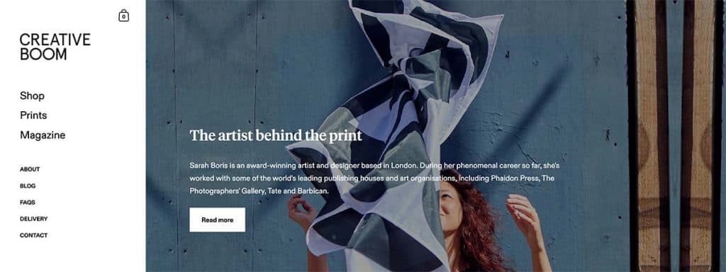
We love the Creative Boom store for its clean, easy-to-read typography. Note the font is not too small whilst remaining very stylish. The end result is that the visitor doesn’t have to overcome the design to engage with the message.
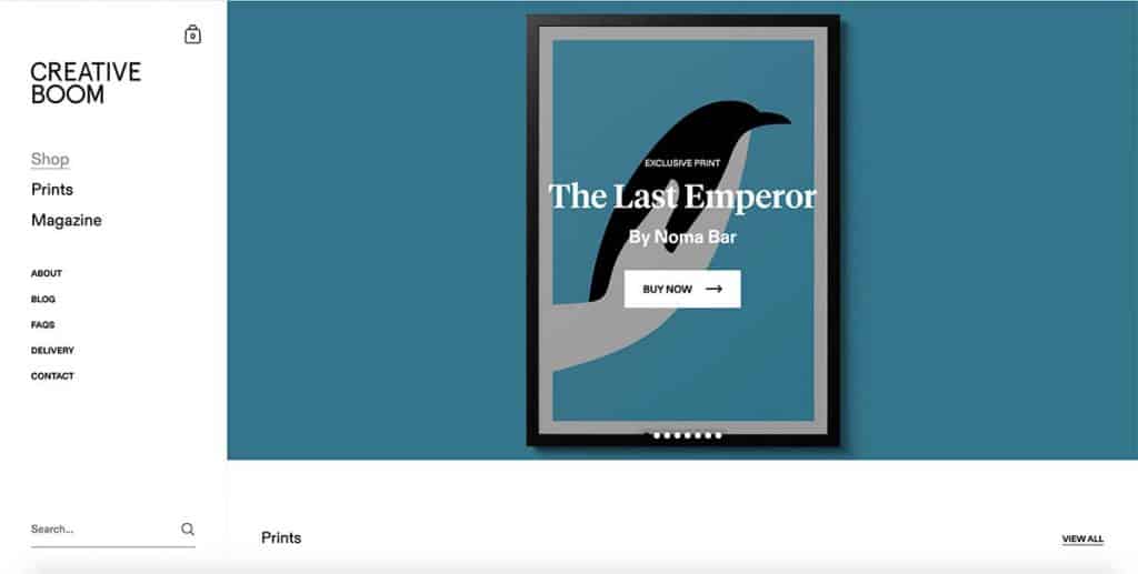
What’s also great about this store is that they put a clear call to action to learn about each artist.
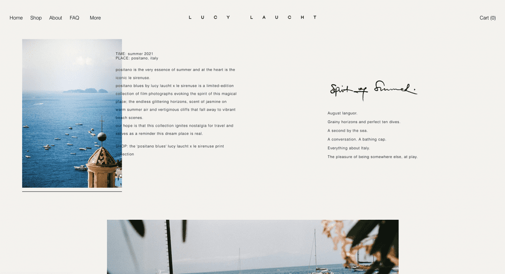
5. Group your work by project and provide context
This might seem like an obvious one, but don’t have all your images on one scrolling page or mix images from multiple projects or styles. Instead, group your work by project, style, aesthetic, or date of creation. This gives instant context to your progression as an artist and avoids your style looking inconsistent.
On a page that relates to a particular project, it’s great to have context to the project. This can be words, sketches, inspirations, poetry, videos of you talking about the project or showing the project genesis over time. There are no rules of how to contextualise your work, but it’s important that you do.
What we like about Lucy Laucht’s site is how the images are laid out around the text which provides a real sense of project narrative.
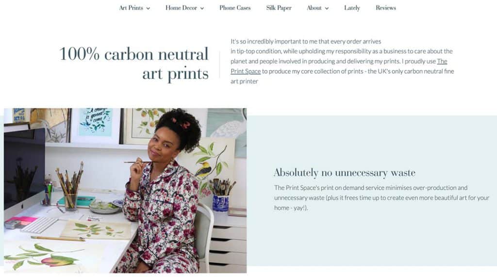
6. Talk about product quality and sustainability
The evidence is mounting as to the fact that sustainability is becoming a huge factor in purchasing decisions, which we think is great. For example, this report by Deloitte shows that 68% of people have chosen brands based on reducing plastic waste, and 43% have chosen brands that have environmentally sustainable practices. This is probably even more applicable to art purchases and is only going to increase over time.
theprintspace is carbon neutral and has eliminated 95% of the plastic from packaging. The only thing we can’t find yet is the frame edge protectors, but we’re working on it. Tell your customers this, because otherwise they wouldn’t know, and this will have the happy side effect of increasing your sales.
Diane Hill has made a very clear point of this on her site:
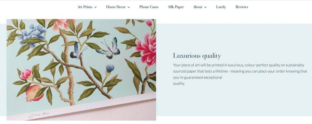
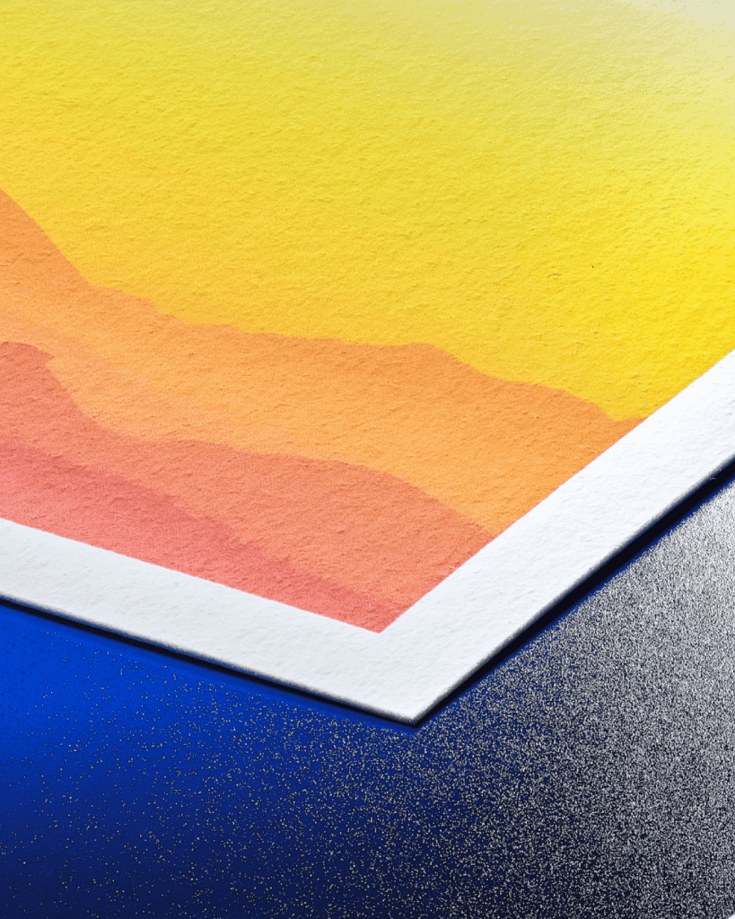
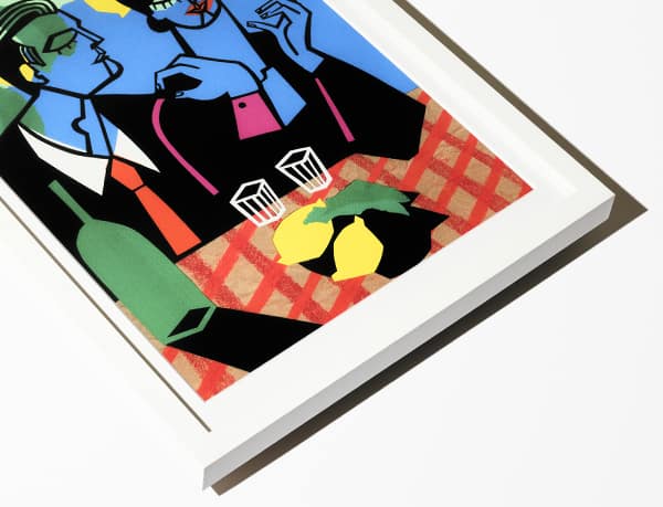
What is also important, and again Diane does this really well, is to emphasise the quality of the print product. Bear in mind that a large proportion of your buyers will not be quite sure as to whether they are getting a poster or a fine art print, and as you know, the difference is huge. In fact, they may not even know what the difference is, but of course they will when they receive it.
You have to work a little bit to explain that difference; the detail, subtle tonal graduations, heavyweight paper and archival properties. This will make the buyer understand why your print costs what it does. We have put together some assets that can help you with this. Get them via this link
Design
7. Website design is the equivalent of packaging to your art career
It is no secret that great packaging and great design signifies quality. Think of the iPhone, a beautifully wrapped present, or artistically presented restaurant food. It sets the frame and impacts people’s perception of quality. Good design may cause more people to buy your art prints, but bad design will certainly put some people off.
How do you ensure good design aesthetics? You start with a clear idea of how you want it to look. How do you do that? You assemble a short list of 4 sites that you like. That way you have a clear guide of what you are aiming at. Don’t assemble a list of 20 references you like, that will be too confusing and contradictory… your list of references should be concise and focussed.
8. Choose and adapt a template, only build a site from scratch if really necessary
Back in the noughties or the early twenty-tens, if you wanted a website you would set aside 6 months and at least £20k. However, in 2022, the number and quality of available website and web-store templates is great, so we see little need to reinvent the wheel and build a site from scratch. A high quality bespoke site design and build will still set you back £10k, whereas some templates are free, and the ones you have to buy range from £40 to £250.
The thing about templates is that by definition, they won’t ever 100% fit what you want. You might want more text here, a different number of images there. This means you end up getting what we call “template design drift”. Something that looked perfect with the example content, now starts to look a bit less balanced.
The way to prevent this design drift is to first understand that everything in the template has been very carefully chosen; the text size, the spacings, the image formats etc. This means you should fit your content into the template rather than modifying the template to fit your content, unless you feel confident with what you’re doing design-wise.
If you are not confident with design, you could use a designer to adapt a template. This should cost less than £1k as it would be 1-3 days work for a competent, efficient designer, depending on how many changes you need.
In order to choose your template, we would first suggest that you create a mood-board of 3-4 sites where the aesthetic complements your brand style. Now, take a step back and look at them side by side…are they consistent? It’s easy with design to get your head turned in a few different directions, so whittle your references down to the ones that share consistent styles.
Then, use this mood-board to create a shortlist of 2-3 templates that fit these references, or give the mood-board to a designer and ask them to suggest an appropriate template that will not have to be completely pulled apart to get to what you want.
When you pick a template that works, be mindful of whether your images are predominantly landscape, square or portrait. Image aspect ratios matter and are the biggest oversight when choosing a template. Ask yourself, what will this template look like with the aspect ratio of my images, which might be variable.
In terms of the platform you should use here are our recommendations:
Shopify. Shopify has the best commerce options, so it’s hands-down our number 1 choice for selling art online. You can easily use it as a full website replacement, or just as your store. In the latter case, people may have built a main site in something like WordPress and they then create their store as a sub-domain (i.e. store.mysite.com) using Shopify. That isn’t a bad way to go because WordPress has great flexibility. However, that means that you are paying to host a WordPress site and paying the subscription on a Shopify store. In the early years of Shopify this was common, as it was harder to build and maintain pages that were not populated with products; i.e. portfolio or project pages. Shopify has come along way, and it can now act as a best in class replacement for your entire website.
Squarespace. If you are an individual artist and you want a nice out-of-the-box design with a blog, portfolio and project pages then Squarespace is a reasonable choice. One thing to also be careful of is that Squarespace tends to use a lot of fixed aspect ratios to display images. For example, it will display everything with certain pages in a square format, or a landscape 3:2 format. It does this to make designs look neat, but this may not suit your images. Using custom CSS, you can adapt the container to the image’s aspect ratio. You will need to know someone who understands how to edit CSS if you’re not sure how. For the Talva template, which we recommend, here’s how to do that.
WordPress & WooCommerce. If you are a gallery or an artist with the resources around you to bring in some web design and development skills, or you have those skills yourself, then the WordPress/ WooCommerce combination is a really great way to go. WordPress is the site building platform and WooCommerce is a plugin that enables ecommerce, and they are both open source. This means they give you the most flexibility to build from the ground up. The choices of themes are great and extensive, plus there are also loads of web developers out there who will help you make adaptations for minimal cost.
Etsy is great for arts and crafts and wall decor. They can certainly help you get traffic and sales going quicker because it is a site with existing traffic. Also, with Etsy there is no site design to do because your products just get listed on your own pages of their site, which already has the Etsy style that cannot be changed.
Based on our experience in online art sales we have some great template recommendations for you. Read our article on The best website templates to sell art online here.
Checkout experience
9. Offer value add delivery
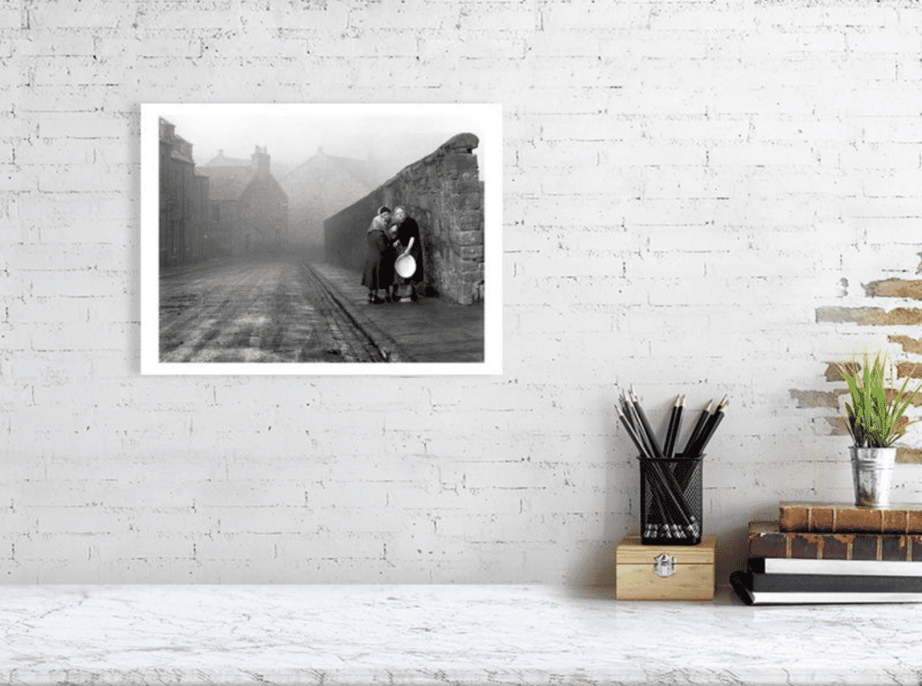
We use fast and reliable shipping providers when we fulfil your art sales. Make sure this is clearly communicated on your website as this is a value add that can increase conversion rates. Check out all the info relating to shipping on our brilliant help centre here.
10. Show the scale of the prints
It is vital to show your site visitors the size of the artwork they are looking to buy rather than simply telling them what the size is. This is because people are visual learners, and it can be hard to visualise what say 24” looks like. For some great examples of this, head back to section 3.
11. State your returns policy
A simple but vital one. When people buy online, they take a leap of faith because they can’t see the product. If they can’t see your returns policy they will probably not buy, as they will assume the policy is no returns which they may feel is high risk. We recommend allowing returns, but in the case of them changing their mind, then the return postage cost should be their responsibility. In the rare case of a print turning up damaged from mishandling in the delivery journey, we replace that free-of-charge, so you should state that too.
12. Is tax included?
You should definitely state clearly whether sales tax is included or not. We think, unless most of your buyers are likely to be businesses, that you should always state your prices including sales tax. An accountant will be able to help you to submit your VAT/sales tax return.
13. Use a chat function on your website
This one is really important! Buyers often need to check in with you on a particular aspect of your products, for example the delivery options, or they may just want to ask you a question about your motivations for making the work. This is the final small nudge that they need to get over the line and buy, and if you are slow to respond or hard to contact then you will lose the sale. We recommend using Facebook Messenger or Whatsapp as a plugin to your site, then you can get any questions directly to your phone. It is reliable, well engineered and free!
14. How fast will buyers get the product
This is absolutely vital! The buyers may have a specific reason to want the print by a certain date, e.g. it’s a gift. Even if not, most people need to know if it will be a week or longer to get their print. Telling someone the likely timeframe to delivery has a proven effect on conversion rates. Most of the time we dispatch your print the very next working day. For more details on shipping times to various destinations you can look at the estimated delivery times in our help centre.
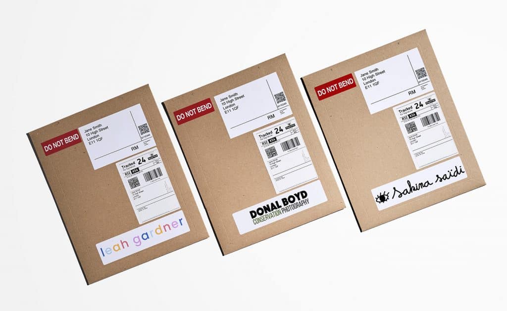
15. Show the packaging
Buyers like to know what the package will look like when it arrives. This might be because it is a gift, for environmental reasons or because they are worried about it getting damaged in transit (which would cause them the hassle of having to return it). With our dropshipping service, you have full control over your brand, so make a feature of it as this will help sales conversion.
16. Offer size options from small to large
People have varying amounts of wall space and want different sizes or prints depending on the type of space they are hanging the work in. Budgets also vary, and of course, size is proportional to budget. We print and dropship your work at all sizes, all you have to do is upload a single file and we automatically resize the image for you. So, after doing all the hard work of setting up a great store, don’t let a lack of size choices be the reason that someone doesn’t buy.
17. Offer framed options
Our research shows that 80% of people want to buy a finished product and hang it straight on their wall. Most people do not want to buy something, or send a gift that requires them or the recipient to have to make a trip to another shop to buy a frame. We now offer framed fine art prints as part of our drop ship service with white, black and natural wood options available.
18. Offer GPay, Paypal and Apple Pay
When you offer these payment options, people can buy on mobile without having to type in all their details. That’s vital to mobile conversions, which in turn are vital to people finding you and buying via instagram or TikTok, as 99% of traffic originating from these sites comes from mobiles.
19. State that you ship globally
Use the long tail of the internet! The long tail and Here comes everybody, are seminal books about how the internet was going to change your life. With art, it is just starting to do that as the pace of growth of online art sales is speeding up. Whatever market you have locally which may or may not be viable for you, globally it will be 10-50x the scale. Your market should be global, so make sure you tell people you ship globally otherwise they will be likely to assume otherwise.
20. Offer a range of product price points
Keep your product range inclusive. Where possible offer some cost effective prints as well as some premium and more expensive products, like originals if you are a visual artist, or a large print or artist proof if you’re a photographer. What you will find is that when you get someone started with collecting your work, they will most likely come back a while later and buy the higher priced works.
21. One thing we could have included but didn’t is reviews
We’re a bit on the fence about this for individual artists. Some people incorporate them and others don’t. If you’re an online gallery we think it really matters. We would be interested to hear from individual artists that have experience of seeing the effect of including customer reviews on their site.
22. Make sure your site has an SSL certificate
That is the tiny lock in the URL bar that encrypts the information that people may enter in your checkout. If you use one of the main platforms for building your site then they will make it easy to add this.

Web Marketing 101
23. Social links
Firstly, we would say put your social links at the top of the site, in the header, rather than the footer. They will be seen 10 times more often, and of course this is where someone can go to get a deeper sense about the artist and your process. They are also more likely to follow you, even if they are not going to buy there and then, this will mean they are more likely to buy from you when they are ready to make their next art purchase. In other words, it’s a great way to turn a casual or one-off visitor into a repeat customer.
24. Mailing list
You should be collecting emails prominently and building your email list. We are not a huge fan of popups for this, we think they are a little too intrusive. However, having prominent panels/calls to action to sign up for the mailing list is vital. To make these work you should tell people how often you will email them, and what benefit they will get from doing so. For example: “Sign up to my monthly update, where I will show you exclusive behind the scenes content from my upcoming projects, invites to my exhibitions and a first look at all new print drops”. A great example of this is can be found on Cathrin Machin’s site.
25. SEO
Optimise your website for SEO, but don’t write copy for the sake of SEO. The first thing you should optimise for is your name. People might see your work around, then Google you, and you want to make sure you come up on page 1 for this search, preferably at the top. Even if that is not possible, the people who Google you are likely to include the keyword terms ‘photographer’, ‘illustrator’, ‘designer’, ‘painter’ etc. at the end of their search, so optimise for this and you are more likely to get good results. After you rank for these terms, then you can go down to more generic terms such as ‘architectural photography London’, ‘flora and fauna paintings’, ‘sketches of New York’ etc.
The important thing to take away from the above points is to get the basics done right, at the start, and then build and improve your content over time. Good luck and if your have any feedback on the list, get in touch at info@theprintspace.co.uk.
Ok so how should you approach the above 25 points? The aim is to get your webstore open and selling for you now, not to wait 3 months to get all the above sorted. So we have broken it down into a simple checklist, in this article: